Bad Interior Design Choices That Can Cost You
Just like the book “If You Give a Mouse a Cookie,” the benefits of a well-decorated space don’t stop when the last picture is hung on the walls. The path of benefits keeps going and going.
To illustrate this, think about how a beautiful home is a more desirable home. A desirable home attracts more buyers. With more potential buyers comes more offers. And with more offers, you have the potential to sell on the best terms possible.
Conversely, the opposite happens when your home struggles in the interior design department. Less interest from buyers means fewer offers, which means selling will more likely be on the buyers’ terms, not yours. In order to avoid this situation, we’re listing the bad interior design choices that we know can cost you. Trust us, we’ve seen it all.
An interior and exterior that completely contrast
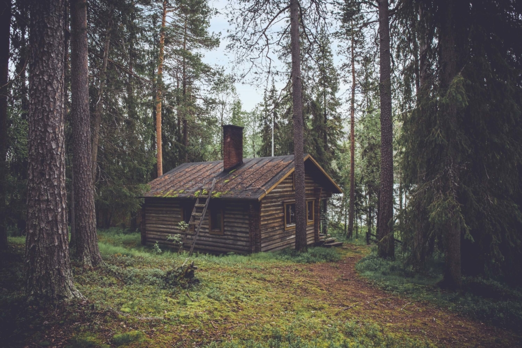
How jarring would it be to walk inside a gorgeous, elegant brick mansion and see it decorated like a log cabin? How off-putting is the thought of a beautiful modern home that has a Victorian-styled interior?
If the thought of these scenarios makes you shudder, that’s for good reason. While things don’t have to match identically (that would also be creepy), it’s good to think of the impression your home gives from the outside and how you can carry that impression inside. A few tips:
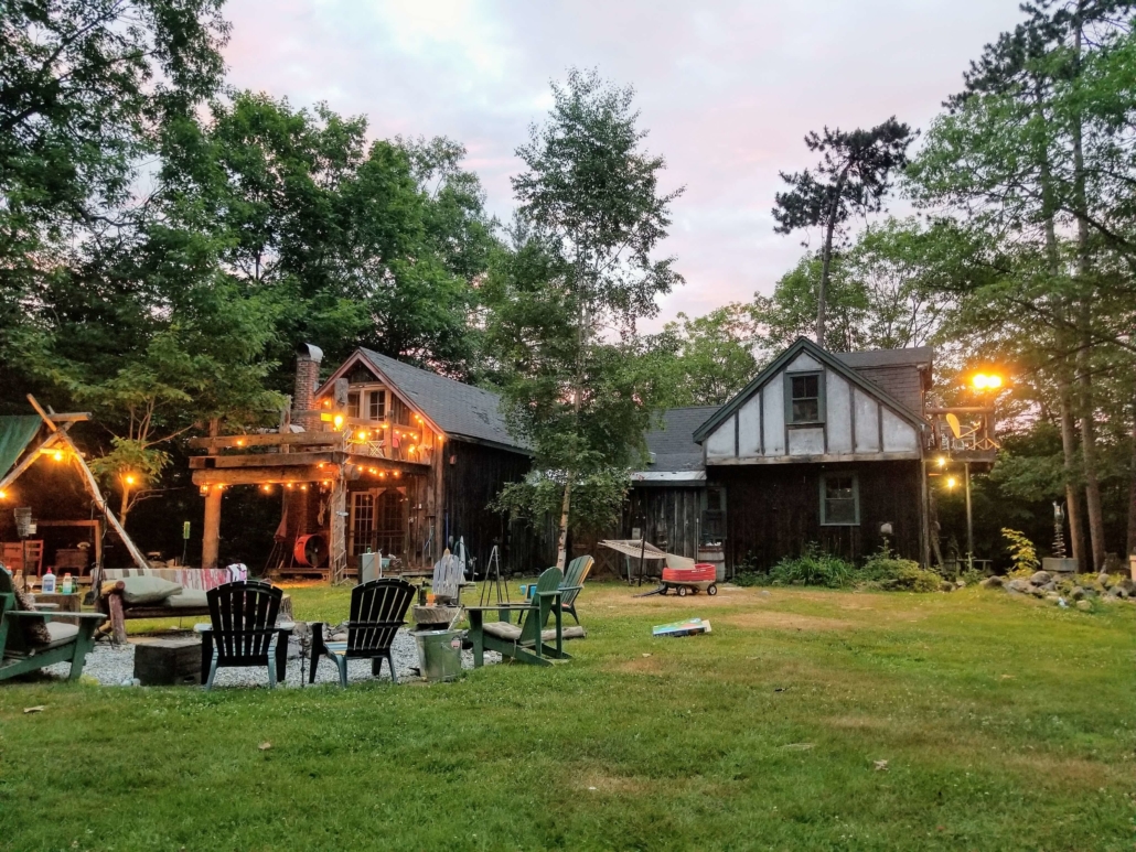
- Play up your location. Southwest adobe, mountain living, seaside or lakefront — carrying elements of the outdoors inside brings a sense of harmony.
- Play to your home’s strengths. A log cabin feels blissfully secluded. A Victorian manor is a slice of history. While you don’t have to perfectly match the interior to these styles, it’s great to keep some of the original elements (and nostalgia) intact.
- Complement colors. A dark brown home exterior would feel off with lime green walls inside. Think about warm and cool tones and try not to overly contrast.
An incohesive theme
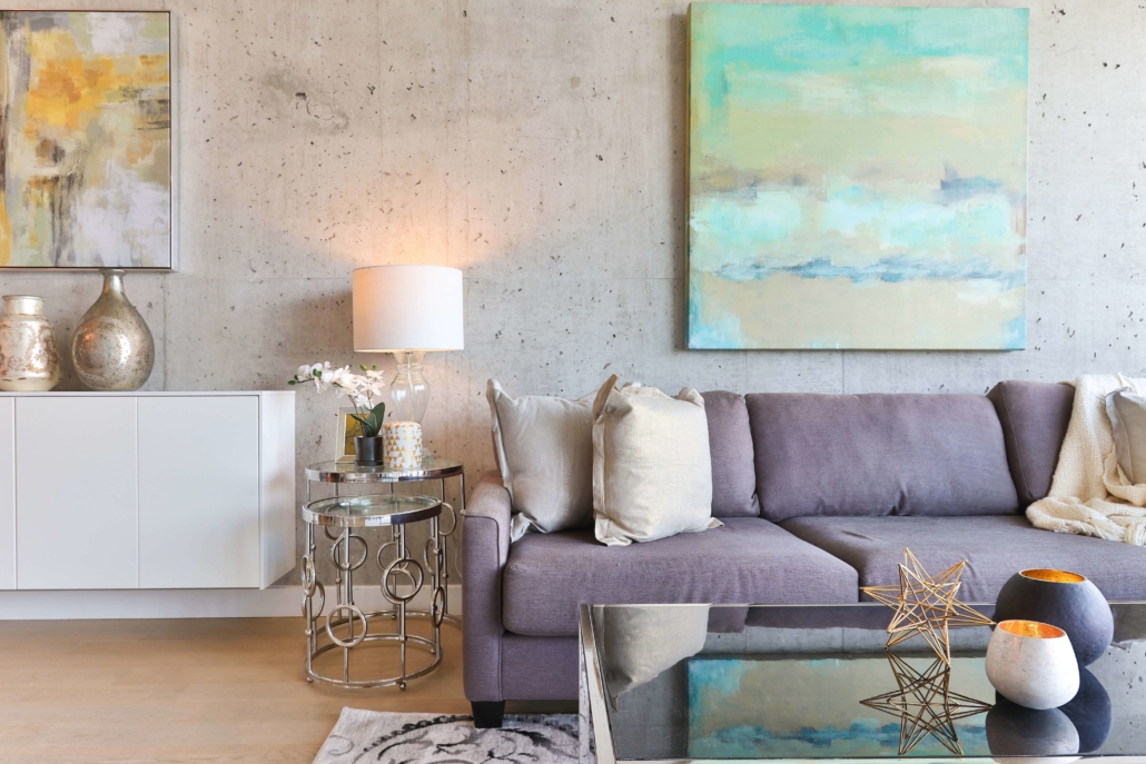
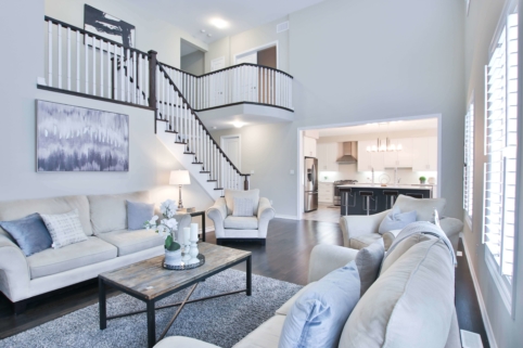
The above photo feels super balanced and welcoming. The best interior design is cohesive and coordinated. While this might be tough with a teenager who wants a “beach resort” bedroom despite growing up in landlocked Wisconsin (not that this writer would know…), bad interior design almost always happens when something feels “off” or out of place.
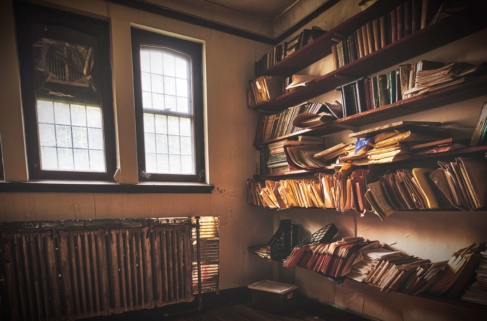
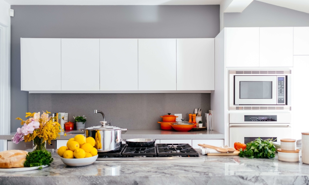
Cohesive design starts with considering colors AND textures. Metal surfaces work wonders in a cool-themed room, but not as easily in a warmer space. A bookshelf — full of textures like wood and paper — inherently feels a bit off it’s placed in the kitchen.
With all this being said, there is a problem if you get too “matchy-matchy.” I had a friend whose mom did a huge Coca-Cola (of all things) theme in all the bathrooms and it was disorienting. One antique Coca-Cola item could have brought the necessary balance and subtlety.
Too many customizations (especially permanent ones).
The Coca-Cola bathroom is the perfect example. Not only are customizations expensive, they can backfire.
Interior design must match your style and personality — after all, you live in this space! But you still have to remember how others feel (sellers and guests alike). A good rule of thumb: don’t go too crazy on the custom if you can’t take it with you.
Sticking too close to what’s trendy in the present.
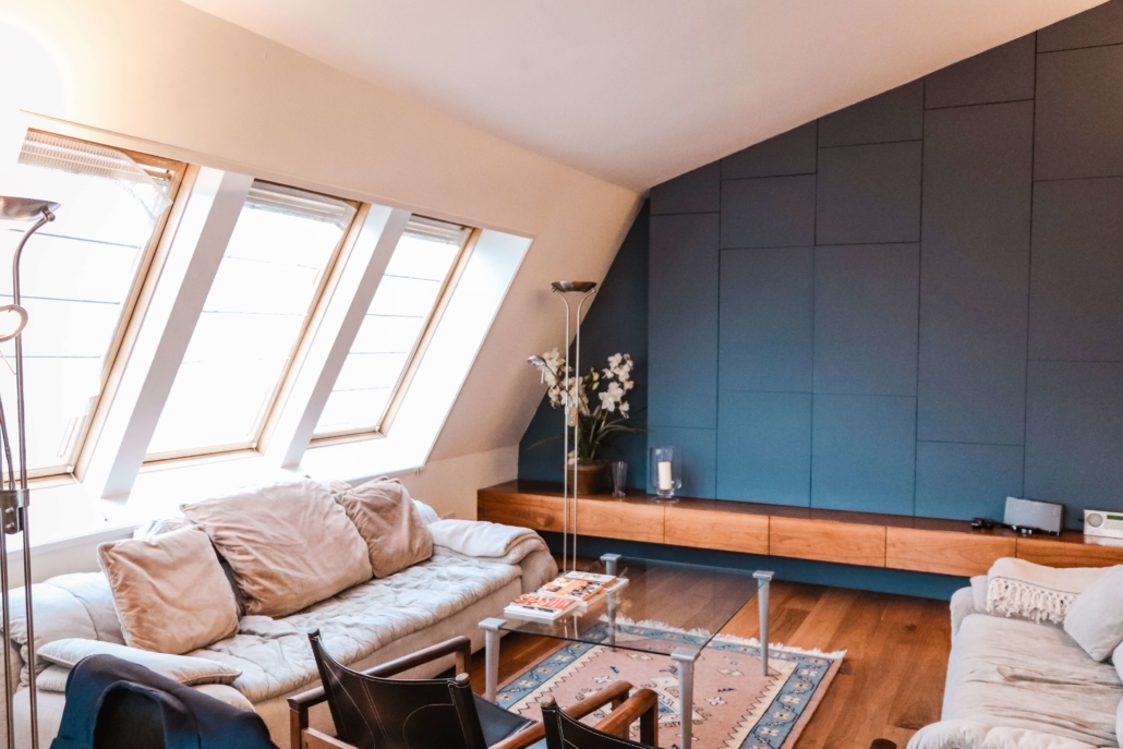
“Evergreen” is a term that means something is good for a long time and doesn’t go out of style. Just like popcorn ceilings and loud ‘80s wallpaper has fallen off the map, the same will happen for lots of other things that are currently trendy.
Does this mean you should forego all trends and interior design? No! Again, just don’t go too overboard if it’s expensive and/or you can’t take it with you. Your adorable hipster bungalow is fresh now, but you wouldn’t want your decorations to be permanent when things around you start to change.
Supplement your space with accent pieces, or for bigger pieces (like furniture), go with something that could exist in various settings (and trends).
Going overboard on what needs decoration and design.
We all know the cringe that comes from seeing a faded pink toilet and bathtub combo. Not everything in your home has to be decorated or serve as a decoration. Certain things (like tubs and toilets) are just fine existing in the standard white. In fact, it’s what we expect and the absence of it is alarming.
You’ve seen the bad interior design choices, we know they’re out there, but you have the power to break them. If you’re currently looking around your house feeling a little creeped out that we’re describing your exact space, fear not! You can always list with RealtyHive instead of starting interior design from scratch in your current space. Selling your home as-is is a great way to leave the past behind and to start fresh. Start with RH today.

